
Colour drenching is painting the walls, ceiling and woodwork of a room in one colour, then choosing curtains, cushions and upholstery from the same colour family. The result is a calm, enveloping room with no hard edges between surfaces. It suits rooms where you want to feel wrapped in colour.
What is colour drenching?
In most rooms the walls are one colour, the ceiling is white and the woodwork is another shade again. Colour drenching removes those breaks. The same colour runs across every painted surface, and often into the fabrics too.
It is not the same as painting a room one colour and leaving the rest alone. The point is that nothing interrupts the colour, so the eye reads the room as one soft, continuous space.
- Walls, ceiling and skirting all take the same colour.
- Doors, window frames and shelves are often included.
- Fabrics sit in the same family, from a close match to a slightly lighter or deeper tone.
Which rooms suit colour drenching?
Rooms you use in the evening, or sit in for long stretches, tend to suit it best, because deep colour feels settled under lamplight.
- Bedrooms: a restful place to be wrapped in colour.
- Snugs, studies and libraries: small rooms with a clear purpose.
- Dining rooms: mostly used after dark, when the colour glows.
- Hallways and cloakrooms: short visits, so a bold choice is easy to live with.
Rooms with a lot of woodwork, panelling or a sloping ceiling can look especially good, because the colour ties awkward angles together. A very bright, open room can handle a lighter drench, such as a soft stone or a pale sage.
How do you choose the colour?
Start from something you already love, such as a fabric, a rug or a painting, and take your colour from it. Our guide to choosing a colour scheme for a room explains how to build from a starting piece.
Then test it properly:
- Paint large sample boards and move them around the room, including onto the ceiling side.
- Look at them in daylight and again in the evening with the lamps on.
- Remember that the colour will cover every surface, so it will look stronger than a patch on one wall.
- Hold your fabric samples against the board before you decide.
Light changes a colour a great deal. A north-facing room usually softens it, and a south-facing room can bring out its warmth.
How do curtains work in a drenched room?
You have two good choices, and both begin with the same question: should the curtains disappear or be seen?
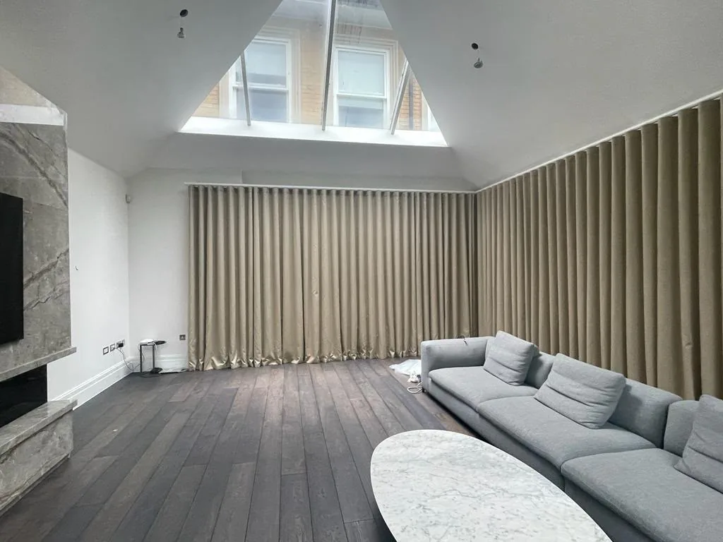
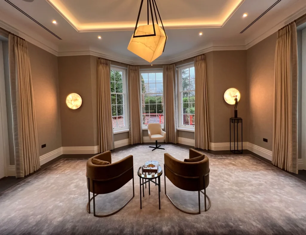
If you want a quiet room, make the curtains the same colour as the walls, or a shade either side. They then blend into the wall and the window feels part of the room. Texture is what stops this looking flat, so a linen weave, a velvet or a woven plain gives the colour some life.
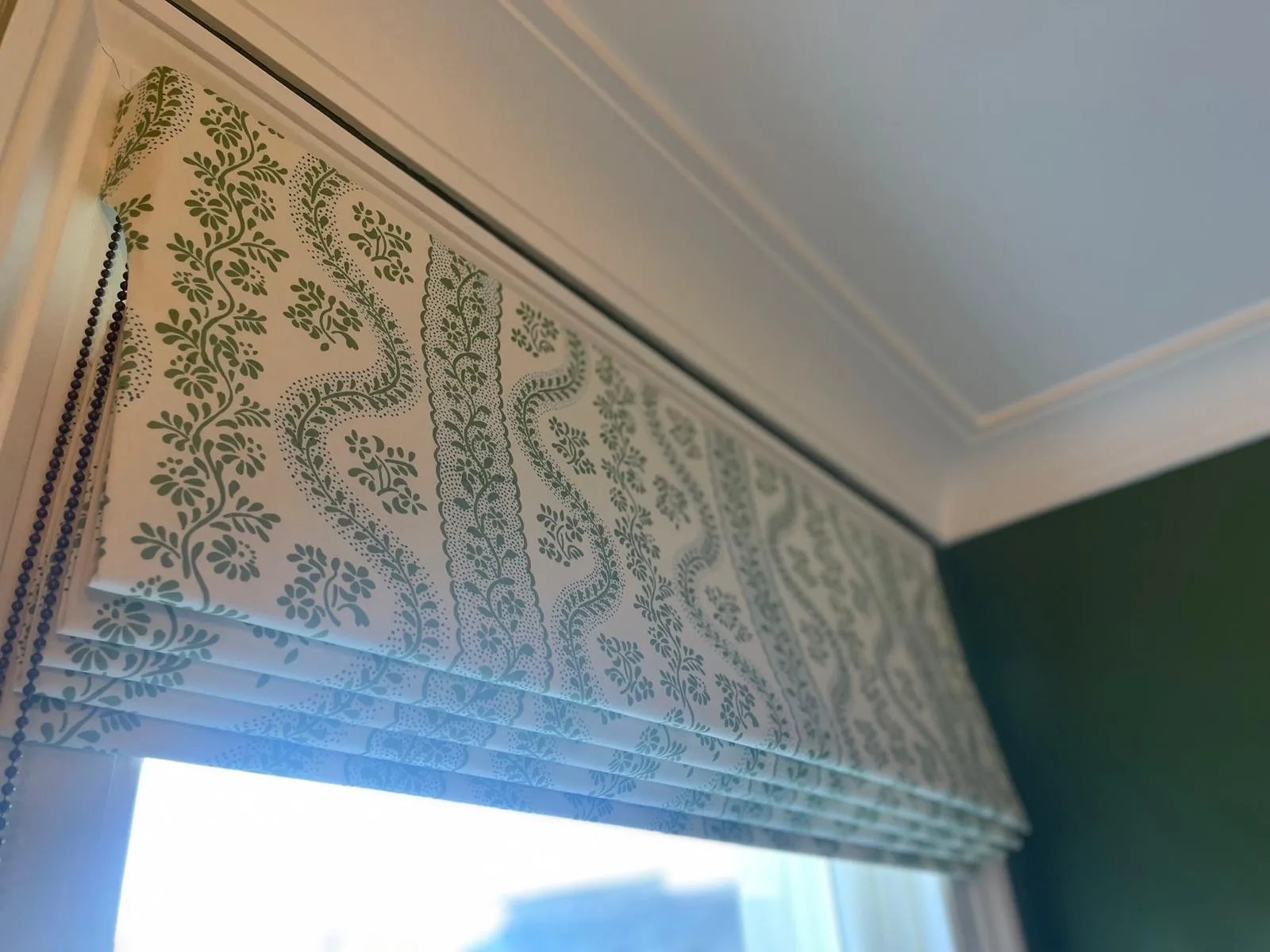
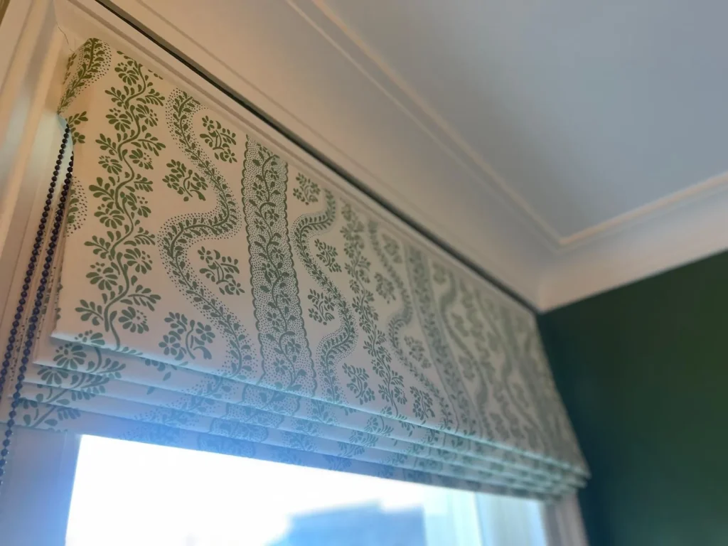
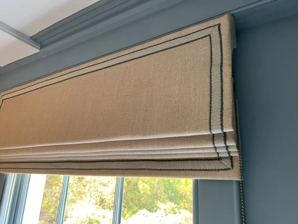
If you want a little more interest, choose a fabric with the same colour in a pattern, or add a contrast border or leading edge. Our made-to-measure curtains are made for the room, so the fabric, lining and heading can be chosen to suit the scheme. Our Roman blinds made in our workroom show how a blind can sit quietly in a coloured room.
How do upholstery and cushions fit in?
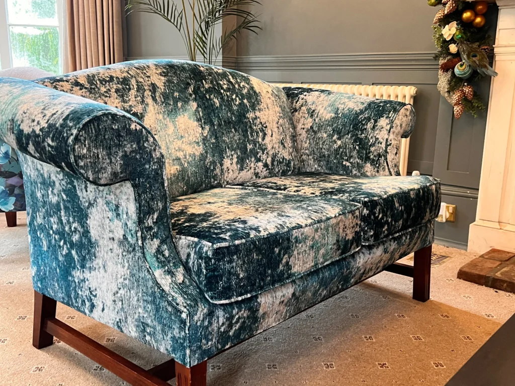
Furniture in the same colour as the walls can look rich, but only if there is variety in the finish. Put a velvet sofa in front of a matt wall, or a woven chair against a painted one, and the room has depth without adding a second colour.
| Approach | What it looks like | Where it works |
|---|---|---|
| Close match | Furniture melts into the walls | Calm bedrooms and snugs |
| Deeper or lighter tone | Furniture reads as a soft shape | Living rooms and studies |
| Contrast accent | One piece stands out | Dining rooms and hallways |
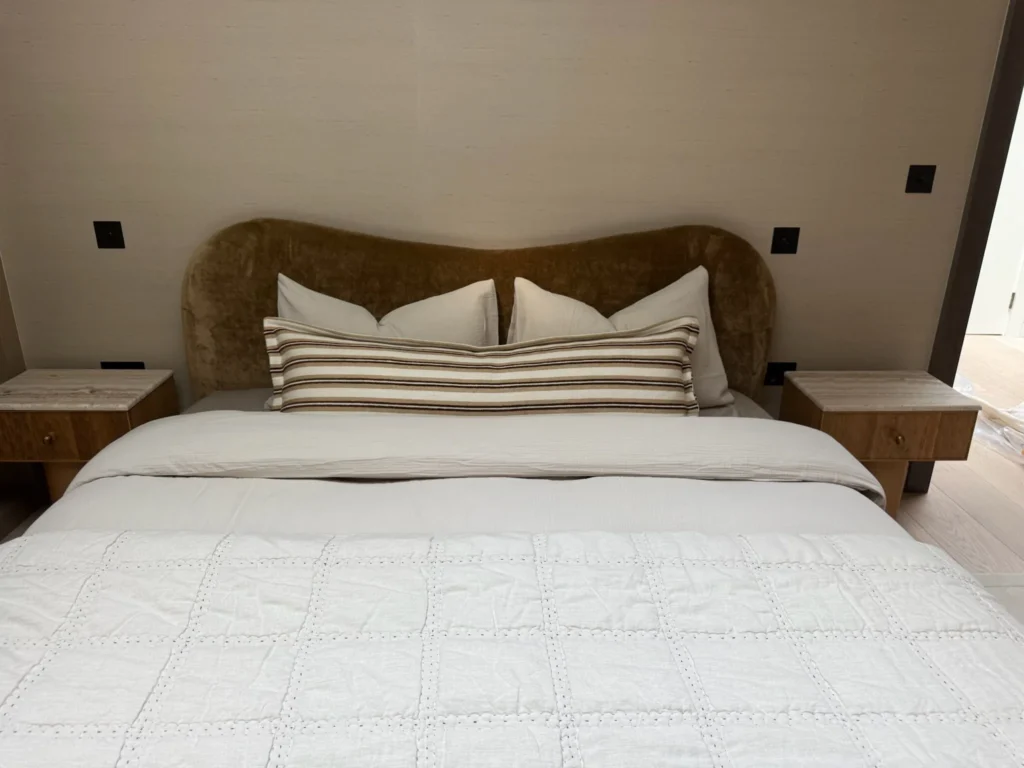
Our upholstery and headboards are made in our own workroom, so a chair or headboard can be covered in the colour you have chosen. Cushions are the easiest place to add a second tone, and you can find out more about cushions and soft furnishings on their own page.
What are the common mistakes?
- Choosing the colour from a tiny chip. Always test a large board.
- Using the same finish everywhere. A flat matt wall with a slightly firmer finish on the woodwork gives a gentle contrast without changing the colour.
- Forgetting texture. One colour needs several textures to stay interesting.
- Leaving the floor out of the thinking. A rug or flooring in a neighbouring tone stops the room feeling boxed in.
- Skipping the lighting. Warm lamps at different heights make a drenched room feel inviting.
Is colour drenching right for you?
It asks for confidence, but it is easy to change later, and a good fabric makes it much easier to live with. If you like the idea but cannot picture the finished room, an interior design conversation can help you work out the colour, the fabrics and how they come together.
Tell us about the room and the colour you have in mind, and we will help you think it through.