

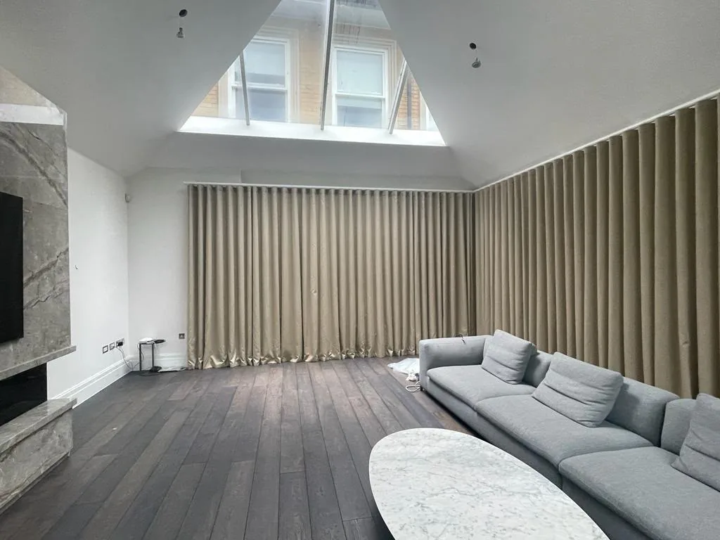
To choose a colour scheme for a room, start with one thing you love, such as a fabric, a rug or a painting, and take two or three colours from it. Then look at the light the room gets, decide which colour leads and which ones support it, and test real samples in the room before you commit.
Where should a colour scheme start?
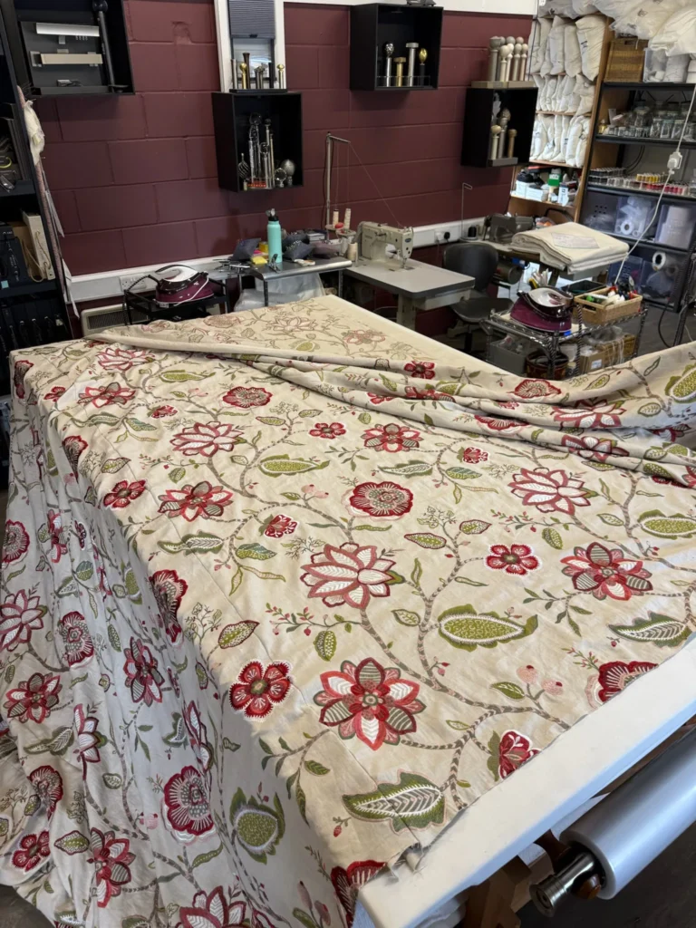
A blank wall and a paint chart is the hardest place to begin. It is far easier to start from something with colour already in it, because the colours in a good fabric or rug have been balanced by its designer.
- A fabric: a curtain or upholstery fabric you keep coming back to is the most useful starting point, because it usually ends up covering a large area of the room.
- A rug: rugs often hold three or four colours in proportion, which gives you a ready-made guide.
- A piece you already own: a painting, a sofa you are keeping or a family piece of furniture. Building around it means the room still feels like yours.
Lay the starting piece out and pick out its main colour, a second colour and one small accent. Those three are the bones of your scheme.
How does the light in a room change colour?
The same colour can look quite different from one room to the next, so check which way the room faces before you choose.
- North-facing rooms get cooler, softer light all day. Cool greys and blues can look flat here, while warmer whites, earthy greens and soft pinks tend to hold their warmth.
- South-facing rooms get strong, warm light for much of the day. Most colours work, and cooler tones can stop a sunny room feeling too hot.
- East and west-facing rooms change through the day: bright in the morning and dimmer in the evening, or the other way round. Think about when you use the room most.
Artificial light matters too. Look at your samples in the evening with the lamps on, not only in daylight.
How many colours should a room have?
Most rooms feel settled with one main colour, one or two supporting colours and a small accent. A simple way to keep the balance is to let each colour take a different share of the room:
| Role | Roughly how much | Where it usually goes |
|---|---|---|
| Main colour | The largest share | Walls, floor, large upholstered pieces |
| Supporting colour | A smaller share | Curtains, blinds, a second sofa or chairs |
| Accent | A small touch | Cushions, trimmings, lampshades, a throw |
This is a guide, not a rule. Some of the most interesting rooms break it on purpose, but knowing it makes it easier to see why a room feels unbalanced.
Where do curtains and upholstery fit into the scheme?
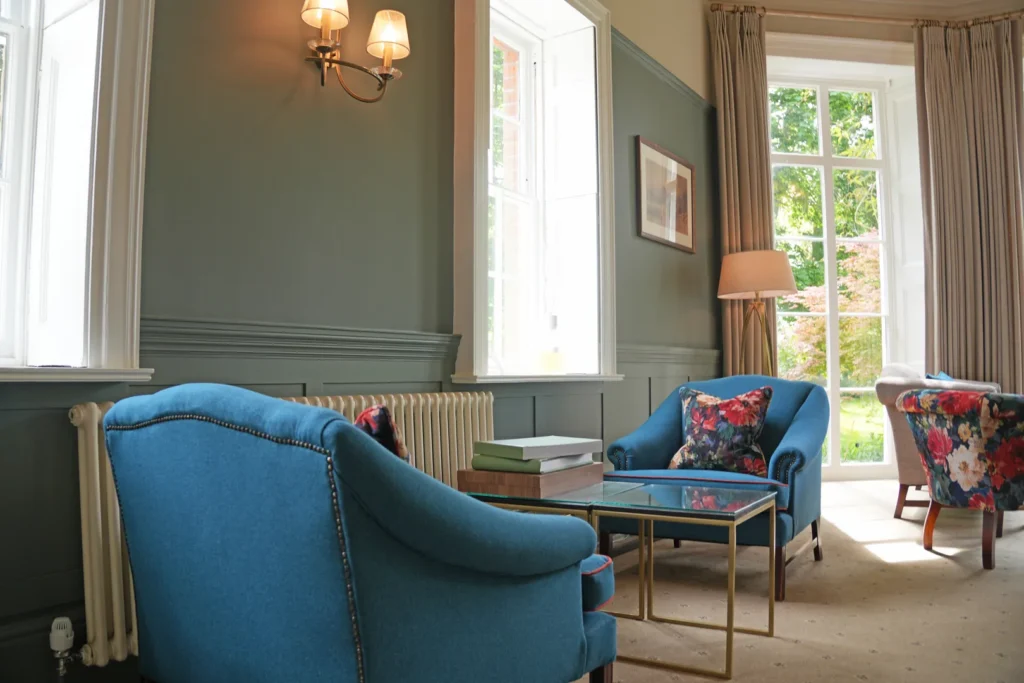
Soft furnishings carry more colour than people expect. A pair of full-length curtains can cover a wall of their own, and a sofa or a pair of armchairs sits right in the middle of the view.
- Curtains can either blend with the walls for a calm room, or carry the pattern and colour while the walls stay quiet. Either can work with made-to-measure curtains, because the fabric is chosen for the room.
- Upholstery is often where the main colour or the boldest pattern goes, because chairs and sofas are seen from every angle.
- Cushions and trimmings are the easiest place for the accent colour, and the easiest to change later. You can see examples on our cushions and soft furnishings page.
How do you carry a colour from room to room?
In open-plan spaces, or rooms you can see into from the hall, it helps if the schemes share something. That does not mean every room has to match.
- Choose one colour that appears somewhere in every connected room, even if only in a cushion or a trim.
- Keep the woodwork and ceiling colour the same throughout, so the changes in each room read as deliberate.
- Change the proportions rather than the colours: a colour that leads in one room can be the accent in the next.
How should you test colours before you decide?
Small chips on a chart are misleading, because colour looks stronger over a large area. Before you decide:
- Paint large sample boards rather than small patches, and move them around the room.
- Ask for fabric samples big enough to see the pattern repeat, and hang them at the window where the light will fall through them.
- Put the paint, the fabric and the flooring samples together, because colours change next to each other.
- Live with them for a few days, at different times of day.
What are the most common colour scheme mistakes?
- Choosing the paint first. There are thousands of paint colours and far fewer fabrics you will love, so it is easier to match paint to fabric than the other way round.
- Too many colours of equal weight. When every colour competes, the room feels busy. Let one lead.
- Ignoring the undertone. Two whites or two greys can clash if one is warm and one is cool. Compare them side by side.
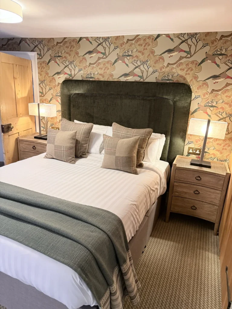
- Forgetting texture. A scheme in one or two colours can still feel rich if it mixes textures, such as a linen-look curtain, a velvet chair and a wool rug.
When is it worth getting help with a colour scheme?
If you have a fabric you love but cannot see how the rest of the room should follow, or you are planning several rooms at once, it can help to work it through with someone. Our interior design service builds on your own ideas and the pieces you already have, from a mood board for one room to a scheme for the whole house. You can see some finished rooms, including Mulberry House Hotel, High Ongar, in our portfolio.